dudu
December 16, 2018, 6:03pm
1
PLEASE READ THIS BEFORE POSTING: Read before posting / reporting bugs
Describe the problem you’re having:
Hope you can fix this, maybe not a real bug though.
If possible include steps to reproduce the problem:
…
tt-rss version (including git commit id):
Platform (i.e. Linux distro, PHP, PostgreSQL, etc) versions:
Please provide any additional information below:
…
fox
December 16, 2018, 6:14pm
2
why not split the regexp into several shorter ones, it would be more readable anyway
e: i mean it’s a bug i suppose that it doesn’t scroll but meh :shrug:
dudu
December 16, 2018, 6:36pm
3
With the long rules,I have had too many rules in one page now. If I split them into lines, the page will be much longer. That will be ugly.
dudu
December 16, 2018, 6:38pm
4
So it’s a bug, you’re going to fix that, right?
fox
December 16, 2018, 6:51pm
5
i’ll try to take a look at this tomorrow
dudu
December 18, 2018, 1:47pm
6
Glad to see the display changes, it helps, thank you!
But I suggest if could put a prompt before each rule will be better.
Looks like this:
fox
December 18, 2018, 2:50pm
7
yeah it should be a bulleted list i guess, i’ll poke at it tomorrow
dudu
December 19, 2018, 11:11am
8
Maybe need a hotfix on 51b069a1ee0017635e6b6639c5a25643c2289c09.
All rules in filter page is green now, and too much white blank space now…
fox
December 19, 2018, 11:30am
9
dudu:
filter page is green now
that’s how it always was, unless they are inverse
well you asked for a more readable layout
dudu
December 19, 2018, 11:38am
10
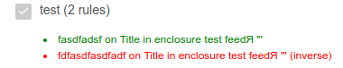
But the inverse rule is also green in “filters” page now, is it normal?
fox
December 19, 2018, 11:39am
11
nope, inverse should be red. i’ll take a look a bit later.
dudu
December 19, 2018, 4:33pm
12
Tested with the latest commit, perhaps still don’t work well.
dudu
December 19, 2018, 5:33pm
14
I don’n know why, but it’s ok now…