Bad UI for checkmarks

checkbox

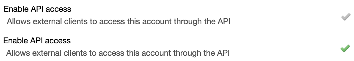
Any chance of changing the UI elements for the checkboxes? The gray/green color scheme is hard for me to read. It would be easier to see a

  • change between a check/X
  • change to “on”/“off”
  • change to a toggle switch icon
  • use standard browser checkbox control

edit:
Running in AWS, Amazon Linux AMI release 2017.09
kernel-4.9.77-31.58.amzn1.x86_64
httpd24-2.4.27-3.75.amzn1.x86_64
php71-7.1.11-1.29.amzn1.x86_64
mysql57-server-5.7.20-2.5.amzn1.x86_64

$ git log --oneline
36eed4d (HEAD -> master, origin/master, origin/HEAD) Merge branch 'master' of binfalse/tt-rss into master

you can customize checkboxes (and anything else) with user css

The gray/green color scheme is hard for me to read.

Bad UI

earth does not rotate around you (or your malfunctioning visual cortex), op.

Hi, you can try one of the themes

https://git.tt-rss.org/fox/tt-rss/wiki/Themes

g.

This is Feedly theme, for example

image

Yeah, either change the theme, or you can change the check box colour only with Custom CSS, it has actually been done before.

https://tt-rss.org/oldforum/viewtopic.php?f=1&t=3640&p=21670&hilit=customize#p21670

Have a read of that, details are there.